

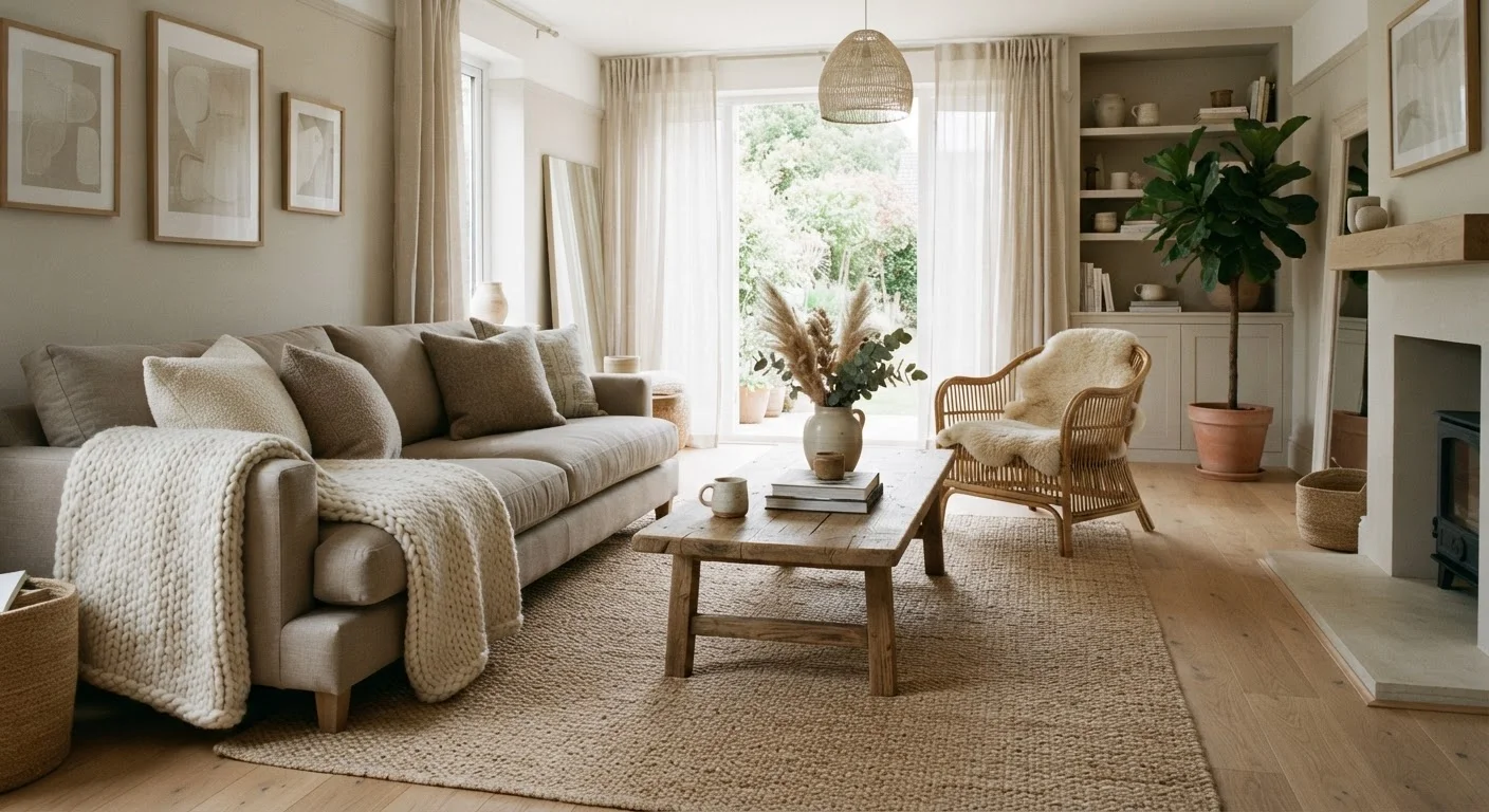
Key Takeaways
- A tonal palette layers related hues rather than identical ones, creating depth without visual noise.
- Texture is the primary tool for preventing a neutral room from feeling flat or sterile.
- Warm and cool neutrals should be mixed intentionally - not randomly - to maintain visual harmony.
- Natural light significantly affects how neutral tones read; always test paint or fabric samples in your actual room.
- A single contrasting material, such as dark wood or matte black hardware, can anchor a tonal scheme effectively.
Tonal Palette
A tonal palette is a color scheme built entirely from shades, tints, and tones of the same or closely related hues - think ivory, cream, sand, taupe, and warm gray all living in one room. Rather than relying on contrasting colors to create visual interest, a tonal palette generates depth through subtle variation and texture. The result is a space that feels cohesive, calm, and surprisingly complex.
In color theory, a tonal scheme differs from a monochromatic one in that it incorporates slight hue shifts and varying degrees of saturation, not just lightness changes within a single hue.
What Makes a Palette Tonal - and Why It Matters
When people say a room looks "boring" in neutrals, the problem is almost never the colors themselves - it's the absence of variation within them. A true tonal palette treats neutrals as a family of related values rather than a single flat shade applied wall to wall. Imagine ivory linen curtains, a sand-colored sofa, a warm taupe area rug, and a greige painted wall all sharing a room. None of those shades match exactly, and that's the point.
The subtle tension between closely related tones is what gives the eye something to travel through. Compare this to a room painted and furnished in one identical shade of beige - that reads as flat because there is no variation for the eye to follow. Understanding this distinction is the foundation of designing confidently without color. For broader context on how this fits within established design styles, see interior design styles worth knowing, which covers movements like Japandi and Scandinavian design where tonal palettes are foundational.
Tonal Is Not Monochromatic
A monochromatic scheme uses one hue at varying lightness levels. A tonal scheme allows for slight hue shifts - warm ivory alongside cool greige, for example - as long as the overall temperature family remains consistent. This distinction gives tonal palettes more flexibility and naturalism than a strict monochromatic approach.
Texture Is the Real Workhorse
In a room without strong color contrast, texture steps in to do the visual heavy lifting. A chunky jute rug reads differently from a smooth wool one even if both are the same sand tone. A matte plaster wall looks nothing like a satin-painted drywall, even in the same greige hue. This interplay of surface quality - rough against smooth, matte against gloss, tight-weave against open-knit - creates the richness that makes tonal rooms feel layered rather than sparse.
Designers commonly refer to at least three to five distinct textures in a well-executed neutral room. Consider the range available: linen, velvet, rattan, raw oak, polished marble, nubby boucle, aged leather, stone, and hand-thrown ceramic. Each catches light differently and contributes its own tactile quality even when the colors are essentially the same family.
Build Texture in Odd Numbers
Designers often recommend introducing textures in groups of three or five rather than pairs. An odd number of textural elements tends to feel more organic and less staged. For example: a smooth ceramic lamp, a woven rattan tray, and a nubby boucle cushion - three distinct surfaces that each catch light differently without competing.
Managing Temperature: Warm vs. Cool Neutrals
One of the most common missteps in neutral rooms is unintentionally mixing warm and cool tones without a guiding logic. Warm neutrals - creams, taupes, oat, warm gray - carry yellow, red, or brown undertones. Cool neutrals - bright whites, blue-grays, greige with green lean - carry blue or green undertones. When these blend without intention, the room can feel visually unsettled even when you can't identify exactly why.
The practical approach is to choose a temperature anchor - typically the wall color or the largest upholstered piece - and then ensure that most other elements share that temperature family. One or two pieces from the opposing temperature can actually add sophistication, just as long as one side clearly dominates. This is closely related to the idea of design cohesion: see what design cohesion means for a fuller explanation of why rooms can feel subtly off even when individual pieces are attractive.
Lighting plays a pivotal role here too. The same paint sample can shift noticeably from morning to evening light, or under incandescent versus LED bulbs. Balancing natural and artificial light is worth understanding before you commit to any tonal scheme.
“The most sophisticated rooms are often those where you can't immediately name a single color - they feel like a mood rather than a paint chip.”
— A widely held principle in interior design practice, Foundational concept in tonal and neutral design
Grounding the Palette and Knowing When to Introduce Contrast
Even the most serene tonal room benefits from at least one grounding element - a deeper value that anchors everything else visually. This might be a dark walnut coffee table, matte black cabinet hardware, a charcoal linen headboard, or a deep chocolate-toned throw. Without any anchoring depth, a room risks feeling washed out or insubstantial, as if nothing has weight.
You can also introduce deliberate contrast through a single feature wall or architectural element without abandoning the tonal approach. The key is restraint: one moment of contrast reads as intentional; several compete for attention and undermine the calm. Our guide on accent wall strategy walks through how to make that one moment count. Within a tonal palette, even a slightly deeper shade of the dominant hue - a warm taupe rather than ivory - can serve as an effective accent wall without breaking the palette's coherence.
3-5
Distinct textures recommended in a neutral room
Interior designers commonly cite three to five texture types as the threshold at which a tonal room achieves visual richness without becoming cluttered.
~60%
Of U.S. homeowners prefer neutral wall colors
Survey data from paint industry sources consistently shows that whites, grays, and beiges are the most commonly chosen wall colors in American homes, making tonal design skills broadly applicable.
The goal is a room that feels resolved and intentional - where every element relates to the others, and the absence of bold color feels like a deliberate, confident choice rather than a failure of imagination.