

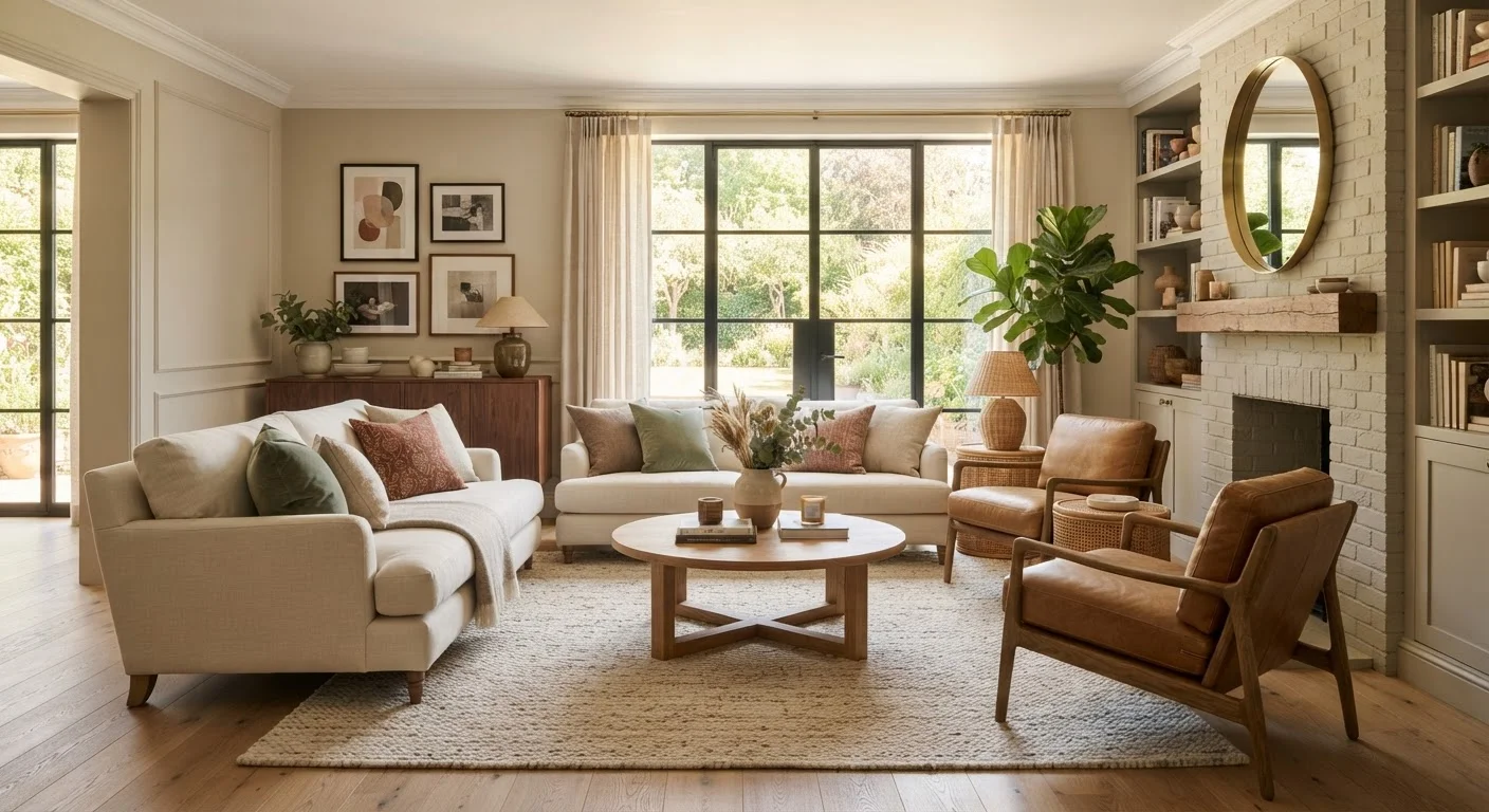
Key Takeaways
- Design cohesion is the sense that all elements in a room belong together, not that they match exactly.
- Missing cohesion is often the reason a room feels 'off' even when it's clean and furnished.
- A limited color palette, repeated textures, and consistent scale are the core tools of cohesion.
- Cohesion can be achieved on any budget by editing existing pieces rather than buying new ones.
- Even eclectic rooms can feel cohesive when they share a unifying thread like material or mood.
Design Cohesion
Design cohesion is the quality that makes a room feel visually unified and intentional rather than random or cluttered. It happens when the colors, shapes, textures, and styles of a space work together toward a shared visual story. You don't need to match everything perfectly - cohesion is about harmony, not uniformity.
Interior designers often achieve cohesion through repeating a limited set of design elements - such as a consistent undertone in a color palette or a recurring material like wood or linen - across multiple surfaces and objects in a room.
Why Your Room Feels Off - Even When Nothing Is Wrong
You've cleaned the house, arranged the furniture thoughtfully, and decorated with pieces you genuinely like. But something still feels unsettled. The room doesn't quite click. If that sounds familiar, the culprit is likely missing design cohesion.
Design cohesion is the invisible quality that separates a room that feels finished from one that feels assembled. It's not about expensive furniture or a particular style - it's about whether your space tells a single, consistent visual story. When cohesion is absent, the eye moves restlessly from object to object without finding a place to rest.
Visual discomfort in a room doesn't always come from clutter. It can come from scale mismatches, competing focal points, or colors with conflicting undertones - all of which are cohesion problems at their core.
3-5
Colors in a well-cohesive room palette
Interior design consensus, widely cited by professional designers and design schools, recommends limiting a room's palette to three to five related colors to maintain visual unity.
60-30-10
Classic interior color distribution rule
The 60-30-10 rule - 60% dominant color, 30% secondary, 10% accent - is a longstanding guideline taught in interior design to help maintain palette cohesion across a room.
The Building Blocks of a Cohesive Space
Cohesion isn't magic - it's the product of a few repeatable design principles applied consistently.
Color Palette
A cohesive room typically works from a controlled palette of three to five colors. That doesn't mean every surface must be one of those shades, but dominant hues and their undertones should relate. A warm-toned beige and a cool-toned grey, for instance, will fight each other even if they're both considered neutrals. Tonal palettes are a particularly effective way to build cohesion without sacrificing visual interest.
Scale and Proportion
When furniture and décor objects vary wildly in size without intentional contrast, rooms feel chaotic. Cohesive spaces use a range of scales but distribute them deliberately - a large sofa balanced by a proportional coffee table, smaller accents grouped so they read as a collective mass rather than individual scattered items.
Repeated Materials and Textures
Repeating a material - wood, linen, ceramic, brass - across multiple points in a room creates a visual rhythm that reads as intentional. You don't need the same piece twice; you need the same material language spoken more than once.
Consistent Style Mood
A room can successfully blend styles, but those styles need a shared emotional register. Rustic farmhouse and industrial metal can coexist because both carry an unpretentious, utilitarian mood. A Baroque gilded mirror in a minimalist room creates tension because the moods are at odds.
Start With What You Already Own
Before buying anything new, take everything off your shelves and surfaces and lay it on the floor. Look for natural groupings by color, material, or scale. Often, the ingredients for a cohesive room are already there - they just need deliberate placement rather than a new purchase.
Real-World Signs Your Space Lacks Cohesion
Knowing the theory is useful, but recognizing the problem in your own home is where change begins.
Cohesion issues often reveal themselves when you photograph a room. The camera flattens visual hierarchy and makes competing elements easier to spot. If your room looks more chaotic in a photo than in person, that's a signal worth heeding.
For smaller rooms especially, cohesion is even more critical. In compact spaces, visual noise is amplified, and a lack of cohesion can make a room feel much smaller and more stressful than it actually is.
How to Build Cohesion Without Starting Over
Cohesion is not a project that requires a full renovation or a large budget. In most cases, it's achieved through thoughtful editing and intentional repetition.
- Audit your palette. Identify the dominant colors in the room and determine whether their undertones align. Remove or recover pieces that fight the palette.
- Find your thread. Choose one material - wood tone, metal finish, or fabric - and make sure it appears in at least three places in the room.
- Group small objects. Isolated small décor items create visual scatter. Grouping them by material or color makes them read as a considered collection.
- Edit before you add. The instinct is often to buy something new to fix a room. More often, removing one discordant piece does more work than adding a new one.
Understanding basic color relationships - even at a surface level - makes palette decisions considerably easier and more confident.
“A room should feel like it has been thoughtfully edited, not just assembled. Cohesion is not the absence of variety - it's the presence of intention.”
— A common principle in professional interior design practice, Widely cited design philosophy