
The Accent Wall Playbook: Choosing Color, Texture, and Placement That Actually Works

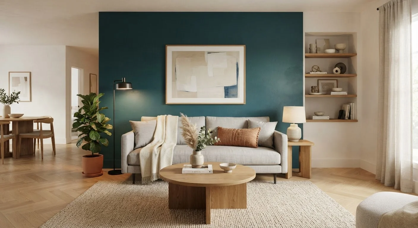
Key Takeaways
- The best accent wall is usually the one your eye naturally lands on when entering the room.
- Color intensity, room size, and natural light all influence how an accent wall reads.
- Texture - through paint techniques, wallpaper, or paneling - can be as impactful as color.
- An accent wall should complement the room's existing palette, not fight it.
- Proper surface preparation is essential before applying any finish to an accent wall.
What you will need
What Makes an Accent Wall Work
An accent wall is a single wall treated differently from the others - through color, texture, material, or pattern - to create visual focus. When done well, it anchors furniture arrangements, adds depth, and gives a room personality without requiring a full redesign. When done poorly, it can feel arbitrary, choppy, or visually heavy.
The difference usually comes down to three decisions: which wall to treat, what finish or material to use, and how the choice relates to the rest of the room. Getting all three right is what separates a polished accent wall from one that looks like an afterthought.
If you've been relying entirely on neutral walls, our guide on designing with a tonal palette is worth reading alongside this one - the two approaches pair naturally.
Use the 60-30-10 Rule as a Guide
Interior designers often reference the 60-30-10 color rule: 60% dominant color (walls and large furnishings), 30% secondary color (upholstery, rugs), and 10% accent color. Your accent wall color can serve as that bold 10%, which means it should connect visually to smaller accent pieces already in the room. This creates cohesion rather than contrast for contrast's sake.
How to Plan and Execute Your Accent Wall
Before purchasing paint, wallpaper, or paneling, take time to assess the room carefully. Walk through each step below in order - skipping ahead often leads to costly backtracking.
What you will need
Identify the Focal Wall
Stand at the room's main entry point and notice where your gaze naturally settles. In a living room, this is often the wall behind a sofa or fireplace. In a bedroom, it's typically the wall the headboard rests against. That instinctive focal point is almost always the right wall to treat.
Avoid walls that are heavily interrupted by windows, doors, or built-ins - the accent effect gets lost in the visual clutter.
Test Your Color or Material in the Space
Never commit to a color or texture based solely on a small chip or a screen image. Paint a sample patch at least 12 inches square directly on the target wall, and observe it at different times of day - morning light, midday, and evening lamplight all change how a color reads. For wallpaper or paneling, request a full sample and hold it against the wall.
Pay attention to how the sample interacts with your flooring, furniture, and opposite walls.
Choose Your Finish or Texture
Color is only one option. Consider these approaches based on your goals:
- Flat or matte paint: Absorbs light for a soft, sophisticated look; works well with bold hues.
- Limewash or venetian plaster paint: Creates layered, organic depth; suits Mediterranean, rustic, or transitional interiors.
- Peel-and-stick or paste wallpaper: Adds pattern or bold texture without permanent commitment; ideal for renters or those who like to refresh decor periodically.
- Wood slat or shiplap paneling: Introduces natural warmth and dimension; can be left natural, stained, or painted to coordinate.
- Board-and-batten molding: Adds architectural structure with paint; suits traditional, farmhouse, or transitional spaces.
Prep the Wall Surface
Fill any nail holes, hairline cracks, or dents with lightweight spackling compound. Allow it to dry fully, then sand smooth. Wipe the wall down with a damp cloth to remove dust and oils. If the wall has never been painted or was previously a very different color, apply a coat of primer before your finish coat.
Skipping prep is the single most common reason accent walls look uneven or begin to peel prematurely.
Apply Your Finish and Evaluate the Result
Apply paint, wallpaper, or paneling according to the manufacturer's instructions. For paint, use two full coats for even coverage. Once complete, step back and evaluate the wall in the context of the fully furnished room - accent walls often look different with furniture in place versus an empty room.
If the wall feels too intense, layering lighter-toned decor (art, shelving, plants) in front of it can temper the effect without repainting.
Once your accent wall is in place, consider how lighting interacts with the finish. Our article on balancing natural and artificial light explains how to adjust your room's lighting layers to complement a bold new wall treatment.
Common Mistakes and How to Avoid Them
Even a well-intentioned accent wall can fall flat. Here are the pitfalls seen most often - and how to sidestep them.
- Choosing the wrong wall. Avoid accent walls on walls broken up by multiple windows, doors, or cabinets. Fragmented surfaces dilute the impact.
- Going too dark in a small room. A very deep color on a short wall can make a room feel compressed. In compact spaces, consider a textured finish or a mid-tone rather than a deep saturated hue.
- Ignoring the ceiling and trim. Your accent color will interact with your ceiling and trim tones. Check that those relationships feel intentional, not accidental.
- Skipping prep work. Cracks, old texture, or peeling paint will show through even quality finishes. See our detailed guide on interior wall surface preparation before you start.
- Treating every room. An accent wall in every room of a home loses its power. Reserve the treatment for rooms where you want deliberate focus - a living room, primary bedroom, or dining area.
Trendy Colors Fade - Timeless Choices Last
Accent walls tied tightly to a color trend can feel dated within a few years. If you want longevity, choose colors with classic roots - deep blues, warm terracottas, forest greens, or rich charcoals - that have proven staying power across decades of interior design. Save highly trend-driven colors for easily swapped accessories instead.
For rooms where you want layered visual interest without committing to a bold color, a gallery wall arrangement on a neutral surface can achieve a similar anchoring effect.