
Gallery Walls Done Right: Layouts, Spacing, and Frame Choices That Hold Together

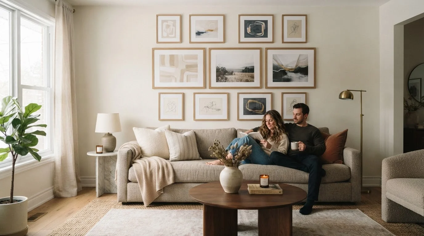
Key Takeaways
- Establish a unifying element - like frame color or mat style - before hanging a single piece.
- Spacing consistency (typically 2-3 inches between frames) is what separates polished from chaotic.
- Plan your layout on paper or the floor first; commit to the wall only when you're satisfied.
- Mix frame sizes intentionally, anchoring the arrangement with one dominant piece.
- Gallery walls work in any room, but scale them to the wall and furniture below them.
Why Gallery Walls Go Wrong - and How to Fix That Before You Start
A gallery wall that looks effortless in a design magazine is the result of deliberate choices made before a single nail goes in. When arrangements feel cluttered or random, it's almost always because the planning stage was skipped. The wall becomes a dumping ground for frames rather than a curated composition.
The first step is understanding design cohesion and how it applies to a grouped arrangement. Cohesion doesn't mean everything matches - it means every element shares at least one visual thread with the others, whether that's finish, subject matter, color palette, or mat style.
Before sourcing frames or picking art, define your constraint: What is the one thing that will tie this wall together? That single decision makes every subsequent choice easier and the final result far more intentional.
Start With a Constraint, Not a Collection
Resist the urge to frame everything you love and see what fits. Instead, decide on your unifying rule first - same mat color, same frame finish, or same subject theme - and then select only the pieces that fit within it. A tighter edit nearly always produces a stronger wall. You can rotate pieces in over time without starting from scratch.
Choosing a Layout That Suits Your Wall and Room
Layout is where most people freeze. There are a handful of proven approaches - and the right one depends on your wall's dimensions, the furniture below it, and your own comfort with symmetry.
Trace and template every frame on paper before touching the wall.
Paper templates let you experiment with spacing and arrangement without leaving unnecessary holes. This step alone prevents most of the frustration associated with gallery wall projects and is especially valuable with asymmetrical salon-style layouts.
Anchor the layout with one dominant piece, then build outward.
Starting with a focal anchor - typically the largest or most visually interesting piece - gives the arrangement a center of gravity. Every subsequent frame is positioned in relation to it, which prevents the scattered feel that comes from placing pieces randomly.
Define the outer boundary of your arrangement before filling the interior.
Knowing the total footprint of your gallery wall - its outermost top, bottom, left, and right edges - prevents the arrangement from creeping too wide or too tall for the wall or furniture below it. It also makes the composition feel intentional rather than accidental.
Limit your frame finish palette to two complementary options.
Using more than two finish types - say, brass, black, and natural wood all together - fragments the eye's path across the arrangement. Two finishes can create visual rhythm and contrast; three or more tends toward noise.
Use a level and a measuring tape, not your eye, for final placement.
Even experienced decorators misjudge horizontal alignment by eye. A small discrepancy in one frame's height relative to its neighbors becomes very visible once the arrangement is complete and you step back.
For smaller rooms or compact walls, a tighter grid or a simple row of three identically sized frames reads as intentional without overwhelming the space. If you're working with a large living room wall, a salon-style arrangement - frames of varying sizes clustered together - gives the wall presence. Learn more about how scale and visual weight function in a room in our guide to small-space interior design principles.
Spacing, Hanging Height, and the Rules Worth Keeping
Two details separate a DIY gallery wall from one that looks professionally installed: consistent spacing and correct hanging height.
57-60"
Recommended gallery center height from floor
Interior designers and museums widely use this range as the standard eye-level hanging height for wall art in residential and public spaces.
2-3"
Ideal spacing between frames in a gallery arrangement
This gap range is consistently cited by interior design professionals as the sweet spot that keeps arrangements cohesive without appearing crowded.
6-8"
Clearance between furniture top and lowest frame
Designers recommend this clearance when hanging gallery walls above sofas or consoles to visually anchor the art to the furniture below.
A gap of 2 to 3 inches between frames is the widely cited standard among interior designers - tight enough to read as a single composition, loose enough that individual pieces aren't crowding each other. Maintain that gap consistently across the arrangement, even when frame sizes vary. Inconsistent spacing is what the eye picks up as "off" even when a viewer can't articulate why.
Hanging height matters equally. The center of a gallery arrangement should sit at approximately eye level - around 57 to 60 inches from the floor - which aligns with standard museum hanging practice. When the gallery wall sits above furniture like a sofa or console, the bottom edge of the lowest frame should clear the furniture top by roughly 6 to 8 inches. This grounds the arrangement visually to the piece below it rather than making it appear to float disconnectedly.
If your room already feels visually busy, consider reviewing why rooms feel crowded beyond furniture before committing to a large wall arrangement.
Frame Choices: Mixing Without Losing Cohesion
Mixed frames can look curated or chaotic - the difference is how you mix them. Choose one or two variables to vary and hold the rest constant.
When 'Eclectic' Is the Intentional Style
Some gallery walls are deliberately maximalist - think collected-over-time salon walls with layered frames, mirrors, and objects. This approach can absolutely work, but it still benefits from one or two unifying elements, such as a restricted color palette for the art itself or a wall color that ties disparate frames together. Intentional eclecticism is different from unplanned randomness; the distinction is always in the planning.
For example: vary the size and shape of frames, but keep all finishes in the same metal family (brass, matte black, or brushed silver). Or vary the finish while keeping all frames the same width profile. Mixing both finish and profile simultaneously, without a unifying color or mat, is where arrangements tend to break down visually.
Mats - the cardboard border inside a frame around the artwork - are a powerful cohesion tool. Using the same mat color (typically white or off-white) across frames of different sizes and styles immediately ties pieces together. A consistent mat also makes budget frames look more elevated.
A gallery wall is also an opportunity to coordinate with your room's broader palette. For guidance on how wall treatments interact with art and décor, see our accent wall playbook.
Quick-Start Steps to Get Your Gallery Wall Up
The gap between planning and doing is where most gallery wall projects stall. These steps cut through the hesitation and get you to a finished wall without costly mistakes.
Once your wall is up, revisit it after a few days. Fresh eyes often reveal whether spacing feels right and whether any single frame is pulling focus in an unintended way. Adjustments at that stage are minor - but they're what take a gallery wall from good to one guests actually stop to look at. If you're redecorating a room from scratch, clearing the room first gives you a true blank canvas to work from.