

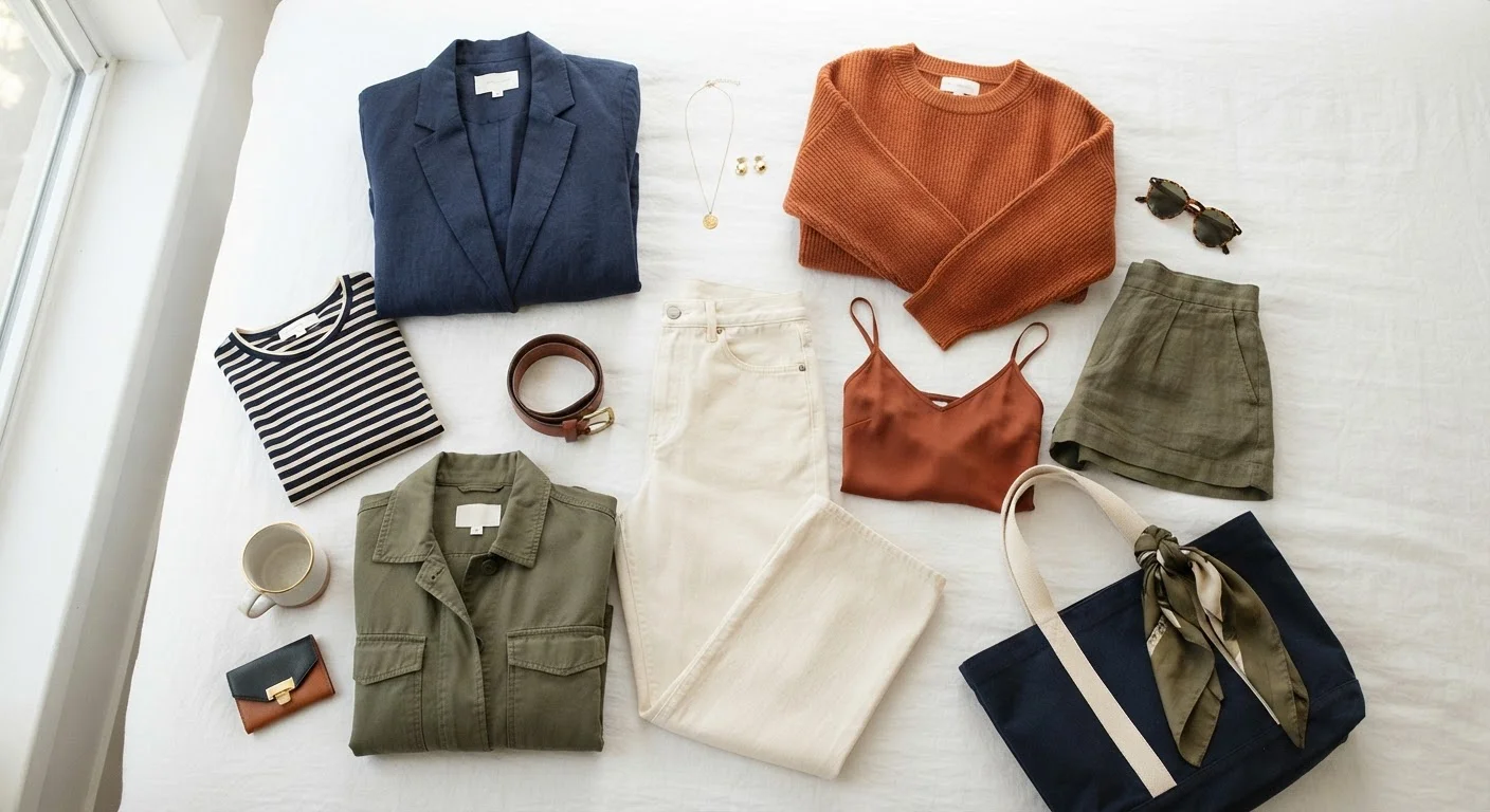
Key Takeaways
- You only need three or four basic color relationships to coordinate outfits effectively.
- Neutrals act as anchors that make any color palette easier to manage.
- Complementary colors sit opposite each other on the color wheel and create high contrast.
- Analogous colors sit next to each other and naturally look harmonious together.
- Tone and saturation matter as much as hue - mixing tones keeps outfits cohesive.
- Start with a neutral base and add one deliberate color accent to build coordination skills.
Start here
Why Color Coordination Feels Hard (And Why It Isn't)
Core knowledge
The Color Relationships Worth Knowing
Put it to work
How to Apply Color Rules to Real Outfits
Refine your eye
Common Mistakes and How to Sidestep Them
Keep growing
Building Confidence Over Time
Why Color Coordination Feels Hard (And Why It Isn't)
Most people who say they "can't do color" aren't actually missing any special gift. They're missing a framework. Color coordination looks mysterious from the outside - like something stylists just instinctively know - but it's built on a handful of relationships that anyone can learn quickly.
The real barrier is usually overthinking. When every combination feels like a gamble, getting dressed becomes exhausting. The good news: a small amount of color theory knowledge pays off in a big way, because the rules are consistent. Once you know them, they work every time you open your closet.
Hue
The pure, base color - red, blue, yellow, green - before any white or black is mixed in. When people say 'color,' they usually mean hue.
Saturation
How vivid or muted a color is. A highly saturated red is bright and intense; a low-saturation red looks more like a dusty rose or brick.
Tone
A color that has been softened by mixing in grey. Tones feel more sophisticated and are generally easier to combine than pure, saturated colors.
Complementary colors
Two colors that sit directly across from each other on the color wheel, like blue and orange. Paired together, they create strong visual contrast.
Analogous colors
Colors that sit next to each other on the color wheel and naturally look harmonious - for example, peach, coral, and red-orange.
Undertone
A subtle warm (yellow, golden) or cool (pink, blue) tint beneath a color's surface. Undertones affect how two colors interact when placed together.
The Color Relationships Worth Knowing
You don't need to study a full color wheel - just these core relationships:
- Complementary colors sit directly opposite each other on the color wheel (think blue and orange, or red and green). They create vibrant, high-contrast looks. Used well, they feel bold and intentional. Used carelessly, they can overwhelm.
- Analogous colors sit next to each other on the wheel (like yellow, yellow-green, and green). They blend naturally and feel harmonious, making them an easy everyday choice.
- Neutrals - white, black, grey, navy, beige, camel - aren't technically on the color wheel, but they're your most powerful wardrobe tool. They anchor any palette and pair with virtually every hue.
- Tonal combinations layer different shades or tints of the same color family (ivory + tan + chocolate, for example). This approach reads as intentional and polished with minimal effort.
Understanding how neutrals interact with statement colors is especially useful. Our guide on balancing neutrals and statement pieces explores this dynamic in more depth.
Use Your Phone as a Color Tool
Before buying anything new, take a photo of the pieces you already own and pull them up side-by-side on your phone screen. Seeing colors together digitally makes it much easier to spot clashes or harmonies than trying to remember from memory. Many people find this simple trick dramatically speeds up the learning process.
How to Apply Color Rules to Real Outfits
Theory only matters if it translates to your actual closet. Here's a practical way to start:
- Lead with a neutral base. Build your outfit around a neutral bottom or layer - jeans, black trousers, a grey sweater. This gives any color you add room to breathe.
- Add one deliberate accent. Choose a top, bag, or shoe in a color that either complements or harmonizes with your neutral. Rust with navy, for example, is a complementary pairing that feels warm and sophisticated.
- Watch your saturation. Two colors can look jarring when they're both at full intensity. Softening one - choosing a muted sage instead of bright green, say - balances the combination.
- Use the 60-30-10 guideline. Roughly 60% dominant color (usually a neutral), 30% secondary, 10% accent. It's not a strict rule, but it consistently produces outfits that look balanced.
Once you're comfortable with these basics, outfit formulas can help you turn color knowledge into repeatable, reliable combinations.
Common Mistakes and How to Sidestep Them
Even with good intentions, a few pitfalls trip people up regularly:
- Matching too precisely. Wearing the exact same shade head-to-toe can read as flat or costume-like. Varying tones within a color family - light blue shirt, darker blue trousers - creates more dimension.
- Ignoring undertones. Colors have warm or cool undertones that affect how they interact. A warm beige and a cool grey can clash subtly even though both are neutrals. Getting familiar with your own undertone preferences helps enormously.
- Overloading on accent colors. Three or more distinct accent colors in one outfit is usually one too many. Each additional hue adds complexity that requires more skill to balance.
- Avoiding color entirely. Wearing only black or grey can feel safe, but it limits your range and sometimes reads as unintentional rather than sophisticated.
Don't Let 'Rules' Replace Your Own Preferences
Color guidelines are frameworks, not laws. If a combination breaks a rule but consistently gets you compliments and feels good on your body, trust that. Rules give you a starting point, but personal style develops when you start making deliberate choices beyond them. No wardrobe formula works identically for every person.
Building Confidence Over Time
Color confidence grows with low-stakes experimentation. A practical approach: introduce one new color relationship per week using pieces you already own. Notice what feels comfortable and what pulls your eye the wrong way - that feedback loop is how instinct develops.
Photographers, interior designers, and stylists all use the same foundational color theory you've just read. It shows up in home design too - the logic behind a well-styled room and a well-put-together outfit is surprisingly similar, as explored in design cohesion principles for living spaces.
Your goal isn't perfection - it's developing enough of a framework that getting dressed feels easier and more enjoyable. Start simple, stay curious, and trust that the rules exist to help you, not restrict you.